
Creating Documentation for FrontEnd Applications
Create a FrontEnd application in a simple and intuitive way.
18 de junho de 2021

This is a repost from blog by Vinnicius Gomes – Senior Frontend Engineer at Zappts.
In this post we’ll talk about how to create documentation for a FrontEnd application in a simple and intuitive way.
If you don’t like old documentation standards like me, your problems are over! 🤩
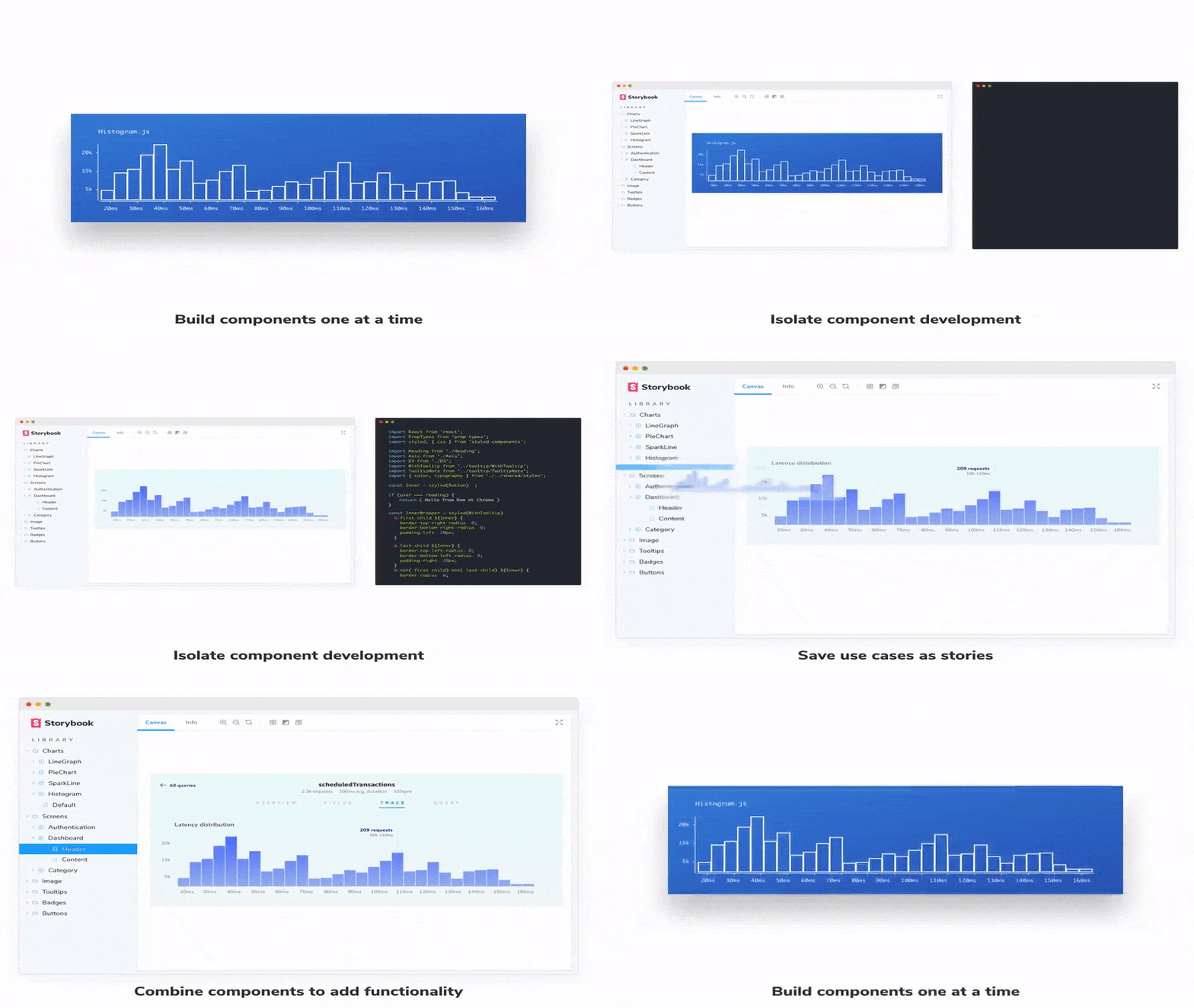
Today I’ll show you a tool that has been gaining a lot of space in the community and market, which is none other than Storybook, an Open Source tool that prepares a development environment for UI components.
So let’s get to what matters 🤓
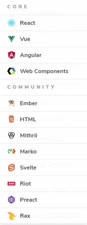
Oh, before we start, I’ll be using Storybook with React, but it supports several other frameworks and libs like 👇
Without further ado, let’s get to the code:
Let’s create a React application using CRA, running the command:
npx create-react-app my-app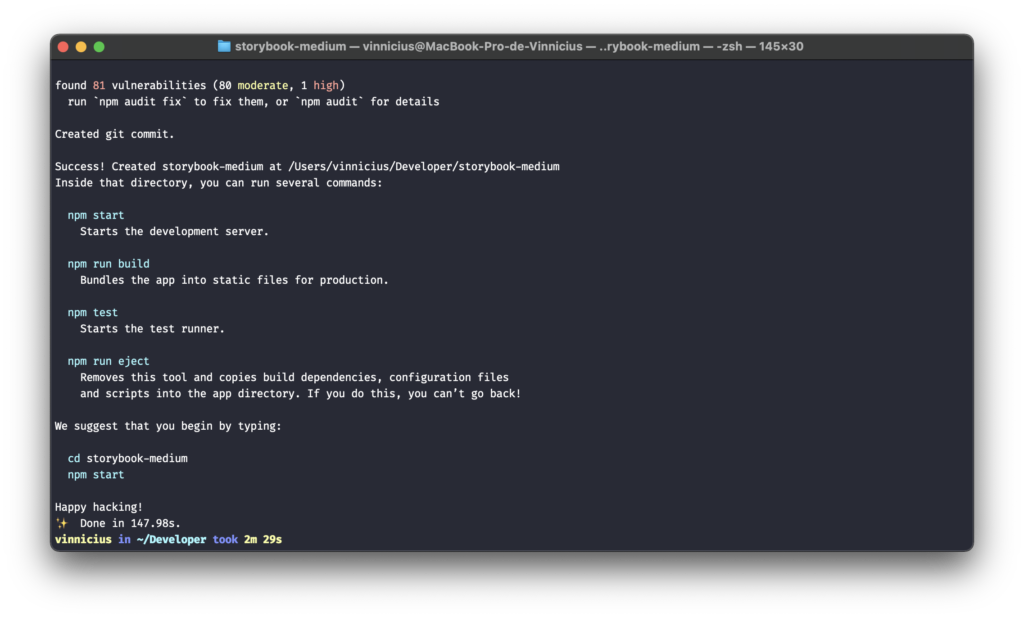
With the project created, let’s install Storybook by running the command: npx sb init
You can access the documentation to learn more about the installation through this link.

After the installation is complete, two folders will be created in our project 👇

A folder called .storybook and another inside /src/stories, the .storybook folder contains the configurations we won’t cover today, but you can read more about these configurations in the documentation, and the /src/stories folder was also created which is where we’ll write our stories.
Let’s run Storybook
Run the command npm run storybook and access http://localhost:6006 you’ll see a screen like this 👇
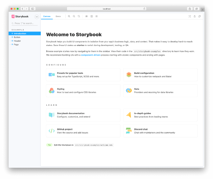
This means our Storybook was installed and is running correctly! 🤩
Now let’s understand the Storybook interface
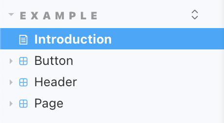
On the left side of the screen, we have the list of stories. Storybook created some example components.
Clicking on the button component, we’ll see something like this 👇
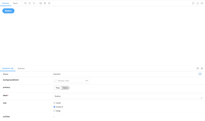
Where the component is rendered, and at the bottom we have a menu with some options where we can interact with the component and see how it works.
In the top menu we have a Docs option, clicking on it will open the component documentation 👇
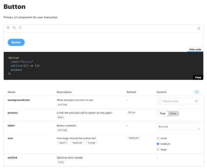
Now let’s create a new Story
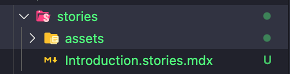
To start, I cleaned up the stories folder leaving only the introduction and assets 👇
Let’s create a simple Alert component, so we’ll create 3 files 👇
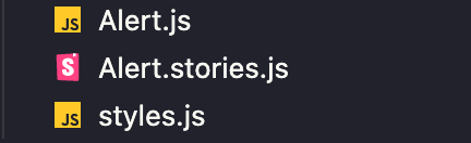
Since the focus of this post isn’t creating a component, I’ll skip that part, the component code is available in this repository.
Our Alert component looked like this 👇
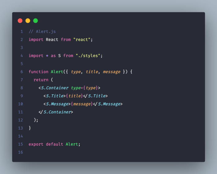
Now let’s create the Story, for that create a file Alert.stories.js 👇
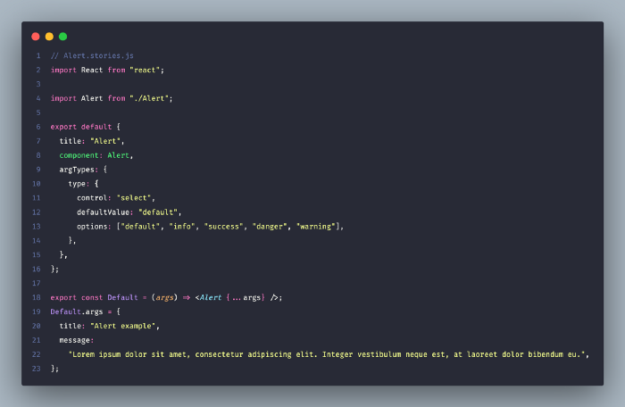
Hang on, I know there’s a lot of stuff here, but I’ll explain the important parts!
Lines 6–16: Here we’re creating the default configuration of our Story, defining a title, pointing to the component and defining the default args. On line 10 we’re defining that the type prop will be displayed as a select on the Storybook screen receiving an array of options:
Line 17: We’re defining our Story
Line 19: Here we’re defining the props for the Default component, which will receive a title and a message
And the result will be this 👇
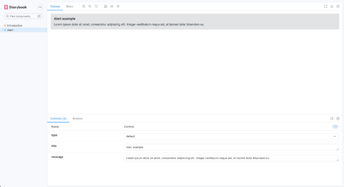
And that’s it, it’s that simple 🎉
Let’s add the other Alert variants 👇
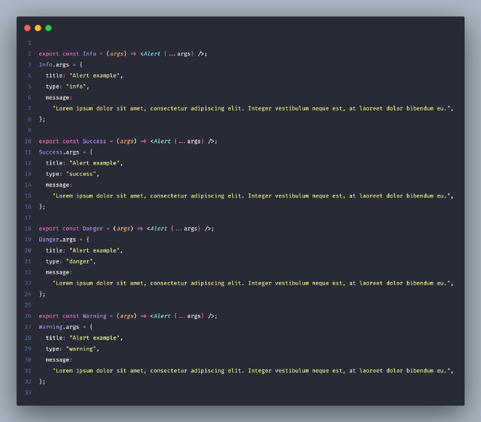
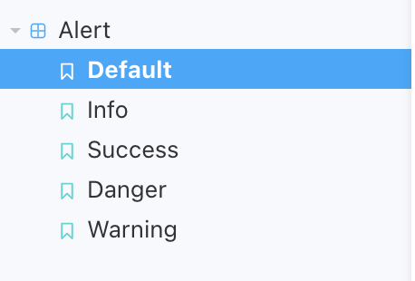
The difference here is that the type prop was added inside args, Storybook will automatically list all component variants 👇
The final Alert.stories.js file looked like this 👇
// Alert.stories.js
import React from "react";

import Alert from "./Alert";

export default {
  title: "Alert",
  component: Alert,
  argTypes: {
    type: {
      control: "select",
      defaultValue: "default",
      options: ["default", "info", "success", "danger", "warning"],
    },
  },
};

export const Default = (args) => <Alert {...args} />;
Default.args = {
  title: "Alert example",
  message:
    "Lorem ipsum dolor sit amet, consectetur adipiscing elit. Integer vestibulum neque est, at laoreet dolor bibendum eu.",
};

export const Info = (args) => <Alert {...args} />;
Info.args = {
  title: "Alert example",
  type: "info",
  message:
    "Lorem ipsum dolor sit amet, consectetur adipiscing elit. Integer vestibulum neque est, at laoreet dolor bibendum eu.",
};

export const Success = (args) => <Alert {...args} />;
Success.args = {
  title: "Alert example",
  type: "success",
  message:
    "Lorem ipsum dolor sit amet, consectetur adipiscing elit. Integer vestibulum neque est, at laoreet dolor bibendum eu.",
};

export const Danger = (args) => <Alert {...args} />;
Danger.args = {
  title: "Alert example",
  type: "danger",
  message:
    "Lorem ipsum dolor sit amet, consectetur adipiscing elit. Integer vestibulum neque est, at laoreet dolor bibendum eu.",
};

export const Warning = (args) => <Alert {...args} />;
Warning.args = {
  title: "Alert example",
  type: "warning",
  message:
    "Lorem ipsum dolor sit amet, consectetur adipiscing elit. Integer vestibulum neque est, at laoreet dolor bibendum eu.",
};
And that’s it, we created our first Story, simple right?! 😎
If you want to run the application on your machine, you can access the repository at this link.
Share this article
Related articles

16 set 2026
The End of Passive SaaS: Why You’ll Pay for Outcomes, Not Seats
The traditional software pricing model based on per-user licenses (seat-based SaaS) faces an inevitable decline in 2026.

09 set 2026
The Timid Autonomy Dilemma: Why Keeping AI in a Suggestion-Only Role Is Killing Your Margins
This article analyzes the financial impact of this "timid autonomy" and advocates for an urgent shift to the "Human-on-the-loop" (HOTL) model.

02 set 2026
The "SaaSocalypse" is actually an architecture and identity crisis.
This article reverse-engineers a real-world success story (anonymized) from the financial sector, dissecting the layers of...